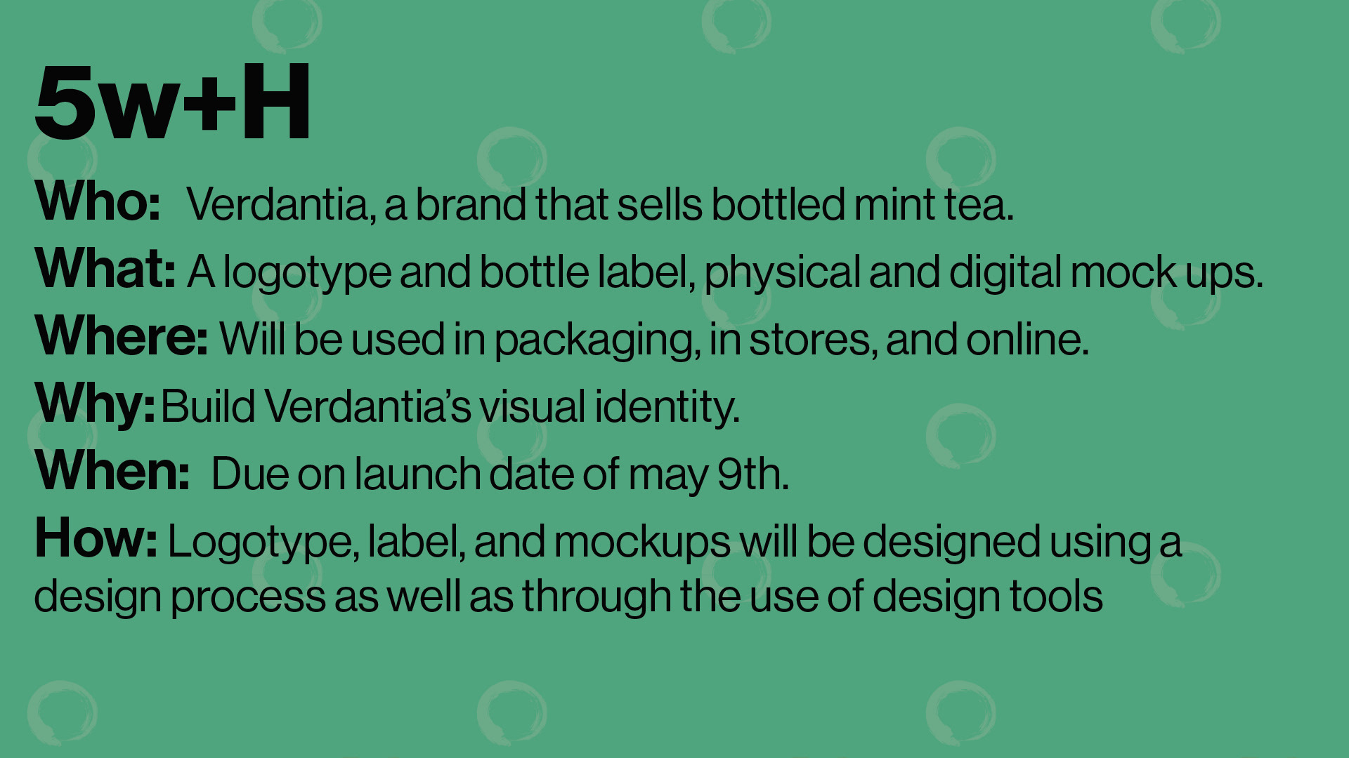
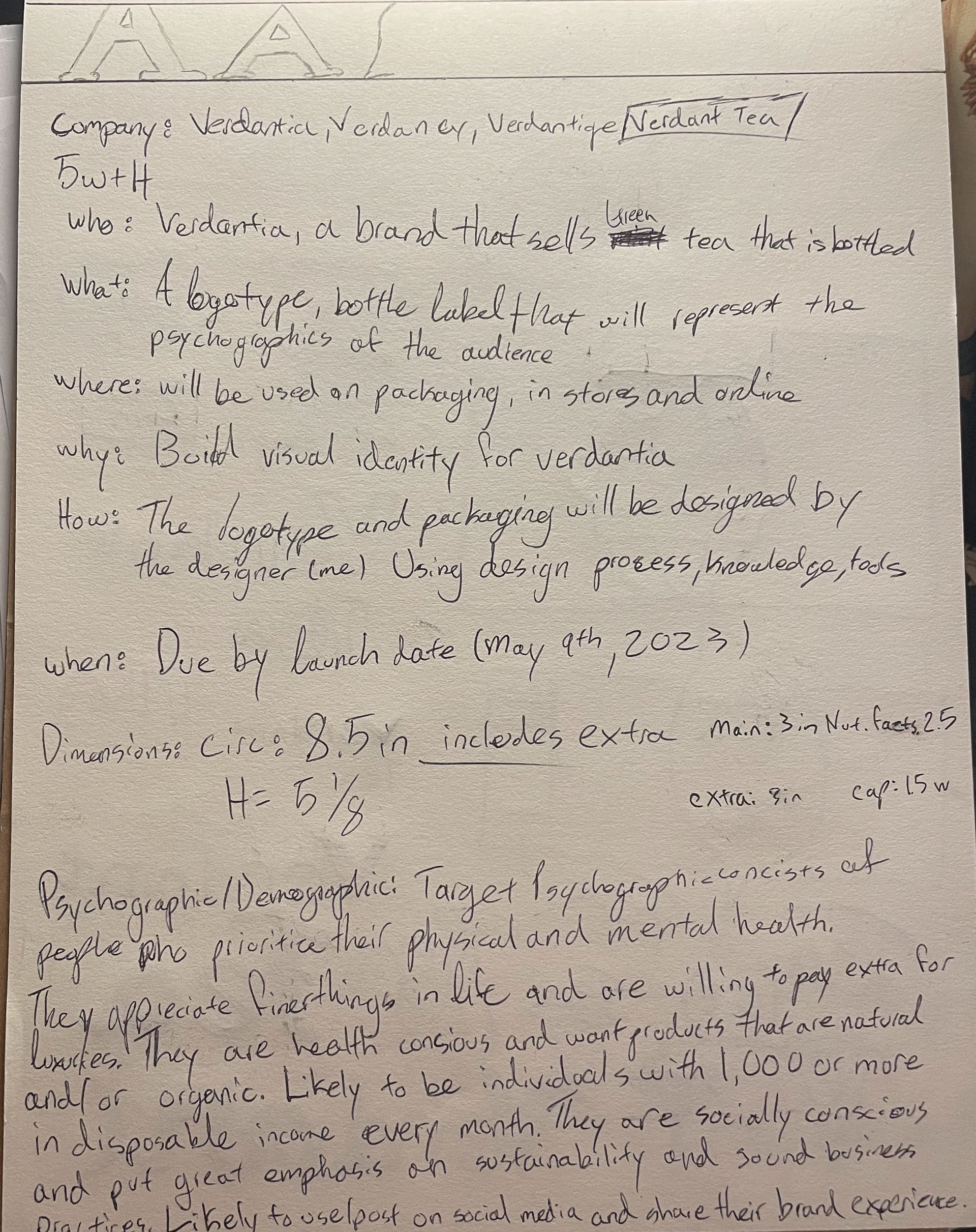
The deliverables of this project were a logotype and bottle label, physical and digital mock ups. Below is a detailed guide through my creative process, starting with defining the problem as well as defining the psychographic and demographic.
Pre-Design: To start the project, I began my research, finding all the relevant information and similar brands/projects to verdant tea. Specifically brands that sell green tea or brands that are health focused.

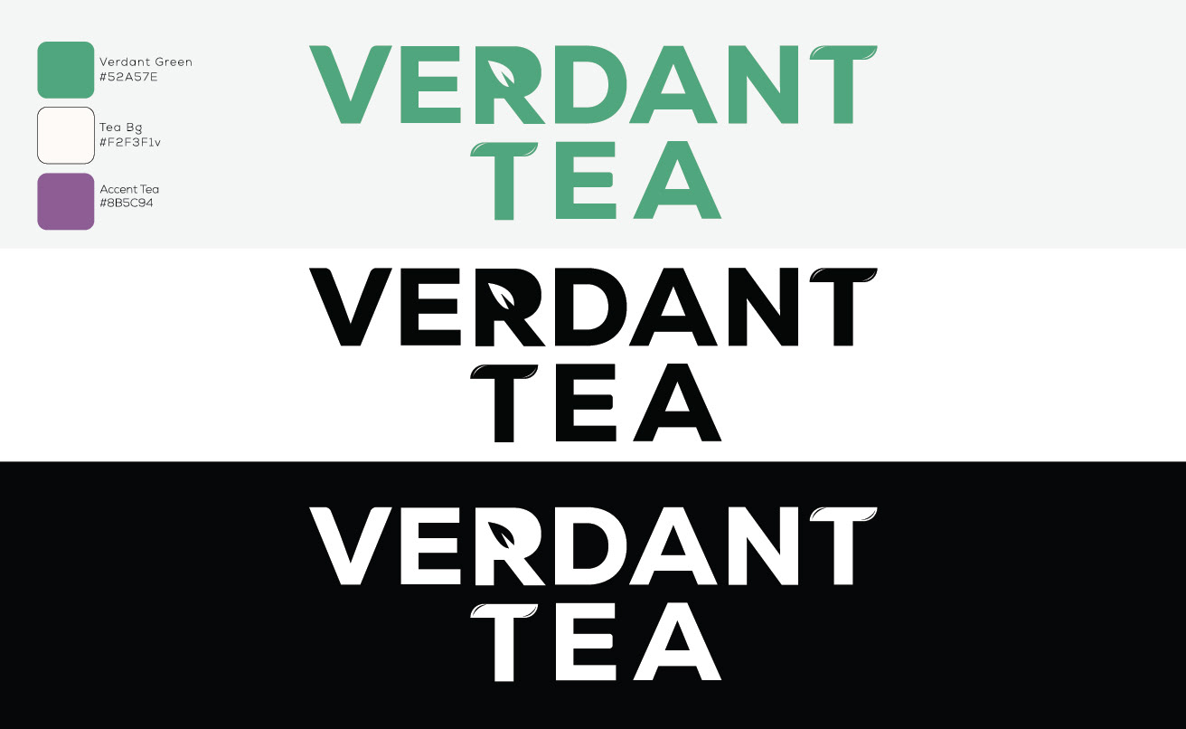
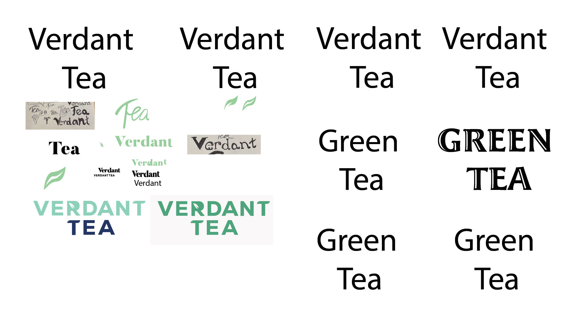
Ideate: After I had defined the problem, I started brainstorming and ideating solutions. I began creating my sketches and color & typography research keeping in mind the end deliverable and the project brief.
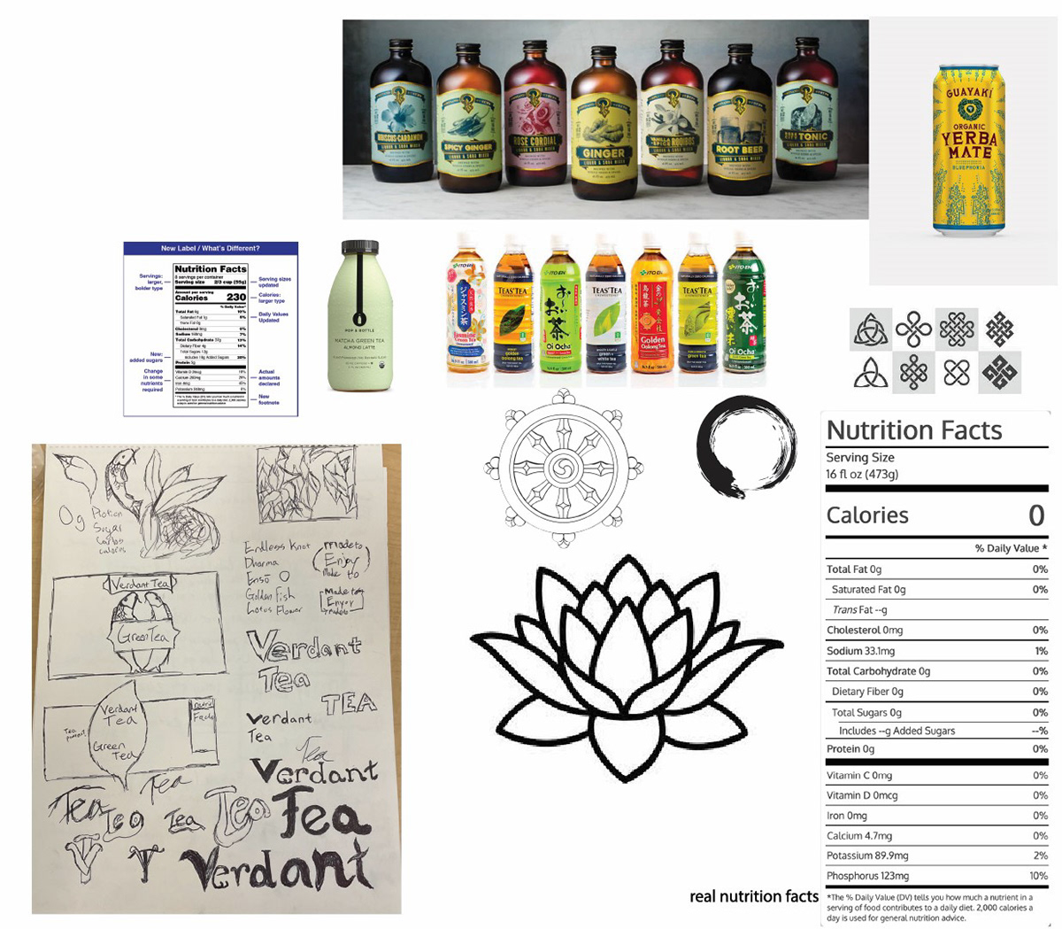
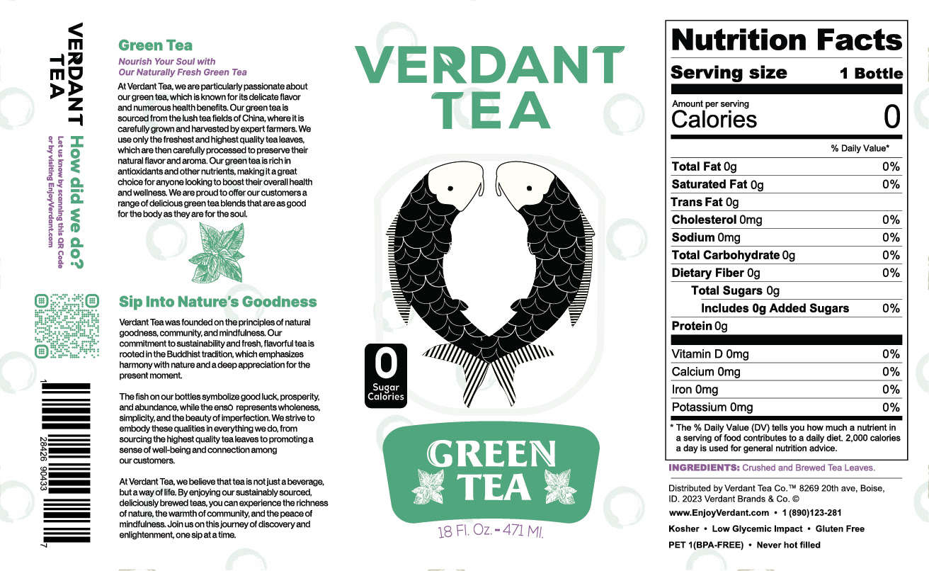
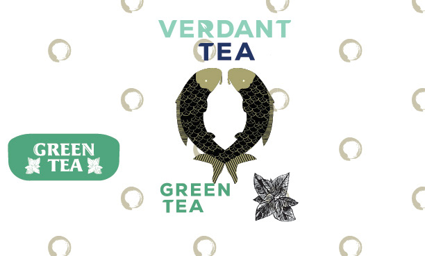
Prototype: During this stage I used my design process/research to guide me through prototyping in my initial ideas. I knew that I wanted to use Buddhist imagery in my designs and began trying out versions using koi fish and the enso. I began using the grid and guidelines to help understand what was and wasn’t working layout wise for my design. During this stage I also received feedback on the design, and revising based on the feedback. During this stage I noticed issues within the alignment and hierarchy of the copy that was to the left of the koi. I used this feedback to create a final deliverable that wash much more successful in its communication as well as better adhering to the principles of design.
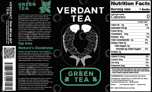
It was during this stage when I was faced with another challenge which was creating a FDA compliant nutrition label for the design deliverable. Following their standards was of the upmost importance, so during my creation of the label I was careful to remain within their guidelines.
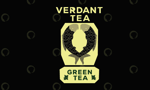
First arrangement of elements
Color Exploration
Layout of label is near complete but color needs work
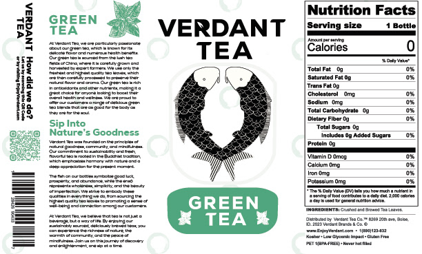
Color is finalized, but there is still room for improvement on the alignment of left panel
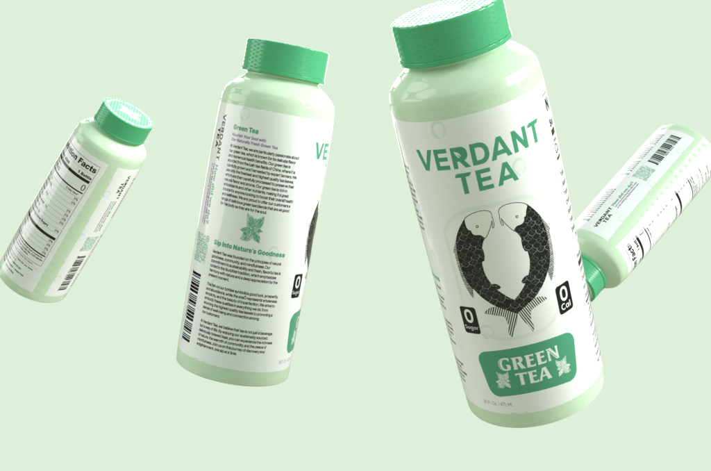
Design Elements & Final Deliverables: The chosen color palette for the brand holds a deliberate significance. The verdant green, embodying the name and essence of green tea, reflects a commitment to natural freshness. The backdrop of a pristine white signifies an inherent luxury in the brand identity.
Notably, the inclusion of the koi fish serves a dual purpose. Beyond being a visual representation of the green tea, it also holds cultural connotations, aligning with Buddhist principles. The koi symbolizes resilience, good fortune, and adds a nuanced depth to the brand's identity.
In essence, the color choices and visual elements are meticulously crafted to communicate not just the flavor of the tea but also the elevated nature of the brand. It is a fusion of aesthetics and symbolism, all aimed at creating a distinctive and compelling identity in the world of premium tea.